
Some weeks ago I implemented support for Python in the Data Warehouse for no reason at all. That was not entirely true I had in mind to introduce graphical support in the Data Warehouse. For some reason I thought there should be better alternatives with Python. I wanted to implement eye candy, a simple way to produce good looking static graphs. A problem with graphs there are so many parameters you have to set to produce nice looking graphs and that is what eye candy is all about. The graphs I had in mind should be practical for the eye rather than the neocortex, for those graphs we use the heavy artillery Qlikview. While searching for a free, easy to use graphical package I found pChart 2.0 written in PHP. You can do all kinds of advanced graphical stuff with pChart, much more than required for my eye candy. pChart is a great software product, while working with it I like it more and more.
I decided to implement a bar chart with optional superimposed line-graphs and make it pretty.
I decided to create a special sql converter for pChart bar and line graphs, which pre-formats SQL result for pChart and feed the result into a PHP program tailored for pChart eye candy. This is the ITL script I used for my first attempt:
<job name='crtGraph01' type='script' pgm='pgraph04.php' >
<image name='dwstat.png' lh='1500x345' type='bar01' sdwhight='56' header='Data Warehouse statistics' footer='Data Warehouse statistics - @MONTH'>
</image>
<bardata columns='@J_crtData01/stem0' axisname='Jobs' series='column.Month'>
<labels array='@J_crtData/report1'/>
</bardata>
<linedata columns='@J_crtData01/stem1'/>
</job>
|
Pgraph04.php is my php script producing the graph. Bar- and line-data comes from a preceding sql job, producing job and MySQL statistics from the Data Warehouses. The other tags are parameters to Pgraph.
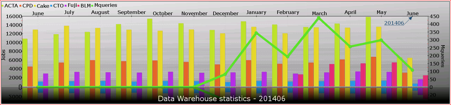
And this the result:

Here you the graph on twitter. I think the result is great but the text is too small to read. After some tweaking I came up with this improved Graph
:
:
It is still hard to read the text in twitter format, but it is much better now. Still these graphs are not intended for this small format. I had mails and other reports in mind for these eye candy graphs. and this is how the ITL script looks:
<job name='crtGraph01' type='script' pgm='pgraph04.php' >
<image name='dwstat.png' lh='1500x345' type='bar01' sdwhight='56' fontsize='13' footer='Data Warehouse statistics - @MONTH'>
</image>
<bardata columns='@J_crtData01/stem0' axisname='Jobs' series='column.Month'>
<labels array='@J_crtData/report1'/>
</bardata>
<linedata columns='@J_crtData01/stem1'/>
<arrowlabel center='1373,52' color='blue' label='@MONTH'/>
</job>
|
If you take a close look at the upper right corner, you see the result of the <arrowlabel> tag. If you change the <bardata> tag to <stackedbardata>, the result will look like this:
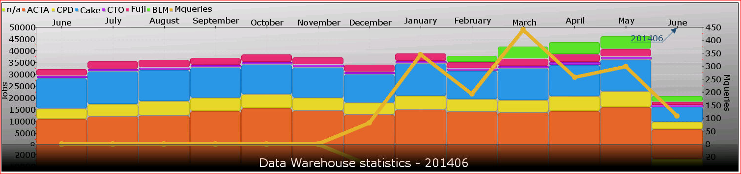
The format is too wide for this stacked bar graph to look pretty. By changing the length/height ratio to 1300x800:
<job name='crtGraph01' type='script' pgm='pgraph04.php' >
<image name='dwstat.png' lh='1300x800' type='bar01' sdwhight='56' fontsize='13' footer='Data Warehouse statistics - @MONTH'>
</image>
<stackedbardata columns='@J_crtData01/stem0' axisname='Jobs' series='column.Month' displayvalues='yes'>
<labels array='@J_crtData/report1'/>
</stackedbardata>
<linedata columns='@J_crtData01/stem1'/>
<arrowlabel center='1175,52' color='blue' label='@MONTH'/>
</job>
|
You get a graph like this:
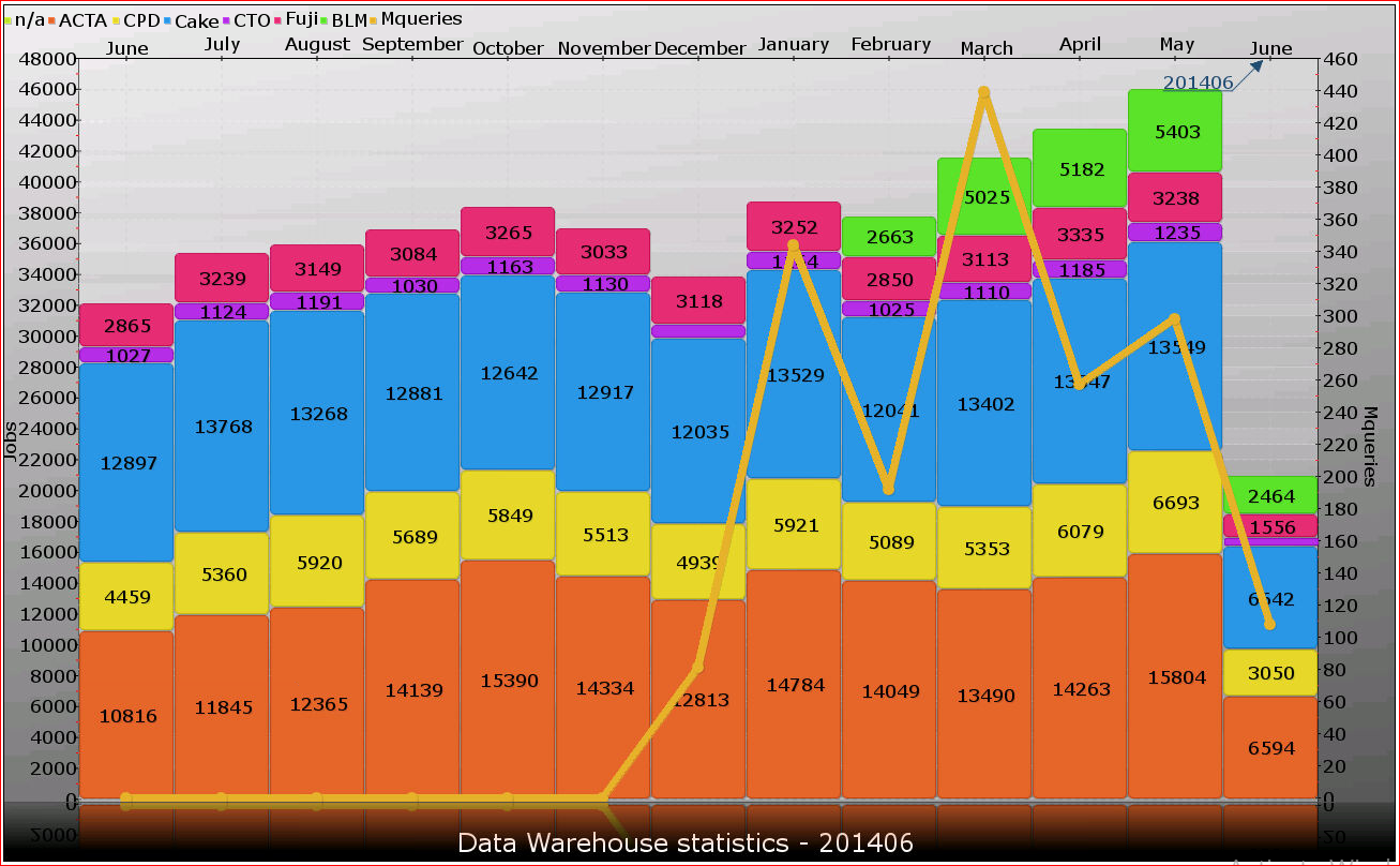
This result is at least prettier, you have to play a little with graph type and size depending on your data to get a nice looking graph.
With very little effort I can produce eye candy. I have not done graphics programming before and it has taken much time, many more hours than I anticipated to write the code that produce these graphs. It has been a very tedious trial and error process, but I learned a lot and it’s nice to have a simple workflow to create these graphs.
In the next post I'll present the SQL converter and PHP script that creates the eye candy graphs.
No comments:
Post a Comment